This part of the portfolio section showcases some of my past work which is no longer online or has been redesigned since I last worked on the project.
Skylar Design
Front-end Web Designer and Developer
See for Yourself
The Actual Work
-
Web Redesign Specialist
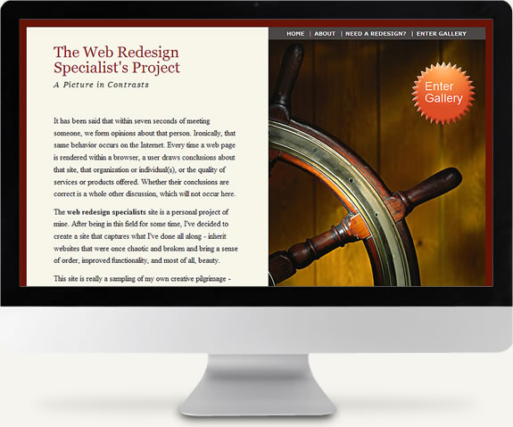
This was a personal project I started to showcase some of my work through the use of contrasts. I took an image of the original website and then juxaposed it with my new design to showcase the differences between the two. To my surprise, the site got quite a bit of traffic over the years. Due to other projects I was working on, I could not continue to maintain this site.
-
-
Mt. Pleasant Crematory
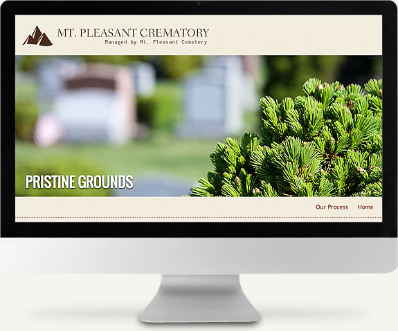
Slated to be just a one page site, its main purpose was to highlight both their unique cremation process and the care Mt. Pleasant Cemetery offers each family member.
-
-
Wesche Funeral Home
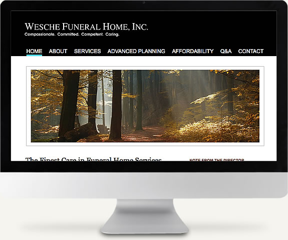
Besides informing Wesche customers of their funeral home services, it was essential their website communicated a hopeful and respective tone. So aside from the copy, it was important that colors, typography, and imagery were carefully selected to reflect the high regard the Wesche Family have for those who use their services.
-
-
First Response Team of America
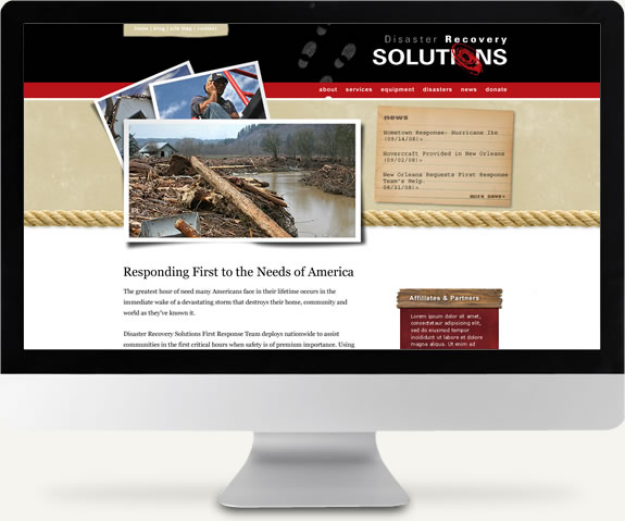
Originally called Disaster Recovery Solutions, this was one of about eight designs I came up with before we decided on the final design. At the time, since the organization was just starting out, the design was fine. However, as the media picked up their amazing work, I had to go back to the drawing board.
-
-
In The Mood Cafe
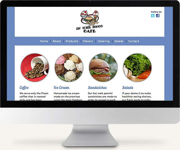
Having been featured in the NY Times & NY Newsday, Ana Mocete has set herself apart from her competitors with her homemade ice cream. Her website has been her main marketing arm and given her the added exposure throughout the tri-state area. And now, her business is expanding to the state of North Carolina.
-
-
Center for Advancement of Christian Coaching
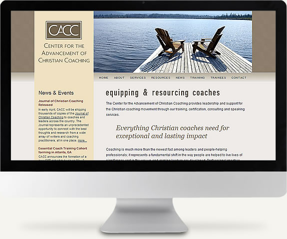
This was a fun project to work on as I had the privilege of working with another startup. Their vision was to train and network life coaches nationwide. The web site was created to help educate, provide resources for trainees, help connect coaches with mentees, and ultimately network coaches across the nation.
-
-
Harold Fish Dyche
Mr. Dyche was running in the primary election for District Judge in the Kentucky Court system and he needed an official website to show his candidacy.
-

-
IEEE Computer Society
As part of IEEE's rebranding, this was one of the redesigns I did for the Membership Benefits region of the site.
-

-
Home Tech Consultants
A technology company, based out of Long Island, NY, provided custom home theater services.
-

-
The Hill Consulting Group
A VA based consulting firm that helps ministries & churches build sustainable health and growth in an ever changing global environment through three vehicles: consulting, training, and coaching.
-

-
Catwalk Photo
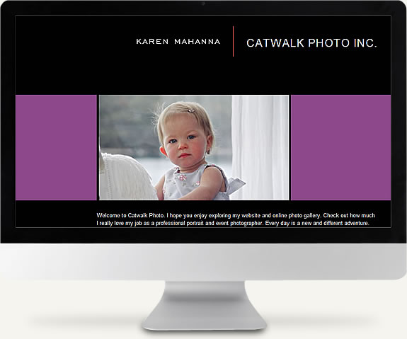
Site built for a professional photogragher. The primary purpose of the website was to showcase the photographer's work through an online photo gallery.
-
-
Claire Jannuzzi Yoga
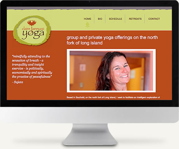
Having already completed one site for Claire, her new yoga site had a very specific goal in mind: besides connecting with her Long Island clientele, she especially wanted to keep her NY City clients apprised to her private yoga sessions.
-
